COVID-19 Response

COVID19 Geoportal

The platform based on location intelligence and cover all the needed data by health organizations, since the registering the cases, contacted persons, and visited places by the case.


Delivering the data to the decision makers with results of analysis and prediction model to know where and who the risky areas, as well give them to figures about the hospitals and their needs and occupations to monitor and take actions for supply demands process.

Dashboard

The COVID 19 Dashboard help the decision makers to monitor the distribution of active cases, confirmed cases, recovered case, death cases as a total number, at any map level, with different types of graphs, and charts.


By reaching the district level the decision makers can easily read the figures by switching to the district’s tabs. So, they can see the all the cases distribution at district level.

COVID-19 Cases Dashboard – Heat Map

The heat map. Where the decision makers can see the registered cases as well the visited places by form registration application.


Providing spatial analysis by integrating the demographic data decision makers can see the distribution in the districts according to ages above 45, by chronic disease, or Emraties distribution.

Data Collection Form

The registration form let the end user in the testing centers and hospitals to register a new case by entering the emirates Id. The system automatically will connect to MOI web service and auto fill the reset of the data, like name, nationality, and mobile number. Then the system will connect to DPM web services and read the home location from tawtheeq, and will the end user flexibility to enter the location with single touch on the map. Then the end user can enter the recent contacted persons with their phone number and ages, to be contacted by the testing center. The end user can enter the recent visited places along with the location, type, and date.

The Prediction Model

Get the expected numbers of the people who might be affected according to the results of the spatial analysis like creating a buffer around the registered cases, and get the risky district according to the demographic data within the buffer.


The prediction part is very important because it’s given the decision maker a figure about the volume of disaster in case not taking a fast action.

Hospitals Dashboard

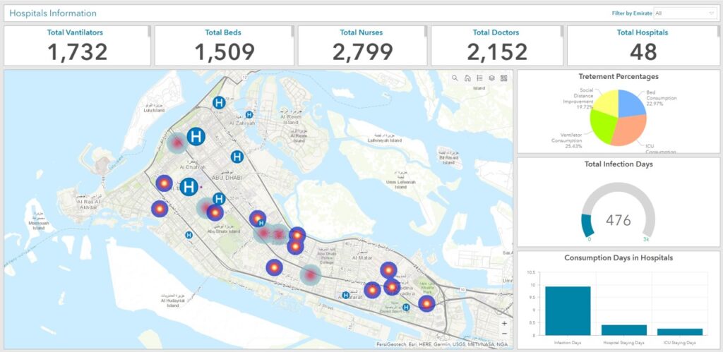
The dashboard for the hospitals shows the map and the total number of ventilators, beds, doctor, nurses, and hospitals and all filtered according to map extend. Treatment percentage pie chart showing the number and percentages of the social distancing improvement this will measured by formula comparing the date and where the cases coming from. Bed consumption represent how many beds consumed during the treatment, as well the ICU consumption, and ventilators consumption same concept.


Total Infection days represent how many days it took till the infected people got recovered. Consumption days in hospital gives a figure how much the total infection days, how many staying days, and how many staying days in the ICU On district level the registered cases, and visited places in heat and this will help in supply, demand process When the decision maker refers to the map and to the results of the indicator, can easily figure what type of support that hospital needs, as well as what kind of supply will happen. When click on the hospital can get the information and make direct recommendation.

Close Bitnami banner
Bitnami